BI_24045687_AS2
Game Description
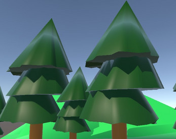
This game is an open-world game that gives players control of a “Medieval warrior” to explore a lush forest environment to find and collect “Gems”. The game has been designed to be played on a mobile device in landscape mode.
UI/UX Design Principles Utilised
The design thinking behind this game has emphasized the following 4 x UI/UX design principles to provide the user with a seamless, functional and consistent user experience.
1) Placement
Because this game uses landscape mode to navigate the main menu and play the game, emphasis has been to place all elements throughout the game in logical areas so as to utilise all available screen real estate in a practical manner.
With the menu scene, all the buttons have been placed vertically in the centre of the scene which reduces cognitive friction for the user due to its simple yet intuitive navigation style whilst also providing visual symmetry with the menu scenes environment.
On the game scene, the “Scale”, “Rotate” and “Move” button positions have been placed in the most logical and comfortable thumb position for the user to navigate. (At the bottom of the screen).
Also on the game scene, the “Reset” button has been purposely placed in the centre bottom position to cause the user to exert more mental attention as to the repercussions of pressing this button which will result in resetting the game character back to its original state. This is also the case with the “Quit” button on the menu scene.
2) Law of proximity
The law of proximity best practices has been followed with the main scene menu buttons and the game scene player control buttons grouping positions to help the user establish a relationship with the related functionality of these buttons and to help them understand their functional purpose.
A detailed explanation of this is on the game scene whereby the player controls “Scale”, “Rotate”, “Move” and “Reset” have all been grouped together to demonstrate to the user that these buttons are all interrelated with essentially controlling the size, rotation, position and resetting of the main character.
3) Accessibility
Due to this game being designed for a mobile device (Which utilizes small screen sizes together with the requirement of users needing to use thumbs/fingers to physically interact with the screen) particular attention has been placed upon designing the buttons to be “Easy to see and use on the screen”.
This is evident with the large size buttons (In relation to the size of the screen) that have been incorporated throughout the game which makes the buttons clearly visible and easy to press for the user. This ultimately enhances the overall level of accessibility for the user.
4) Feedback
Feedback is important for users as to provide them with information that a particular action has been successfully completed. This is especially important and relevant in this game when buttons have been pressed.
Visual feedback has been incorporated into the buttons used throughout the game, whereby there are different colours used for “Normal”, “Hovering” and “Pressing” button states. Basically, most buttons use a combination of white, yellow and grey colours for the above-associated button states.
The only exception to this is the “Reset” button on the game scene and the “Quit” button on the menu scene, which incorporate an orange coloured “Hover” state. This has been purposely designed in this manner to visually indicate to the user that proceeding with pressing these buttons may have unwanted consequences.
Note:
The background image has been used with permission under the Creative Commons Zero (CC0) license. Image link: https://www.pexels.com/photo/nature-forest-trees-fog-4827/
| Status | In development |
| Platforms | HTML5 |
| Author | Birwin |
| Genre | Adventure |
| Made with | Unity |

Comments
Log in with itch.io to leave a comment.
Great work, Brad! Your game character is excellent. It looks like you had great success using ProBuilder to build your character and assets. Your GUI is very well done and I like how the font you chose matches your scenes really well.
The way you have designed your buttons at the bottom of the game scene are well-designed and this has cut down on unnecessary text. My personal improvement would be to have those buttons aligned and have the reset button above the scale button. But still looks really good how it is.
Your effort to conform to UX principles is evident, Brad. And you have applied best practices to ensure an enjoyable experience with your prototype. Well done!
Really good mate, most impressive understanding of UX design so far. The right buttons dont work unless the left buttons are press first on my PC very small thing and something that will not even cost marks but is all i could find about your scene mate. Well Done